

Kenwood Vineyards Rebrand
Located in the heart of the Sonoma Valley, Kenwood Vineyards is dedicated to producing premium wines truly representative of Sonoma County’s world-class vineyards. We worked collaboratively to align the brand's design and packaging with a new brand positioning. In the new strategic platform, a Brand Idea of “Call of the Wild,” and a diversification of the product portfolio were established. We transitioned the strategy into a visual language by creating design principles: “Authentic, Adventure, Crafted, and Wild.” The new brand captures Kenwood Vineyards’ dedication to winemaking craft, love of the land, and historic heritage.
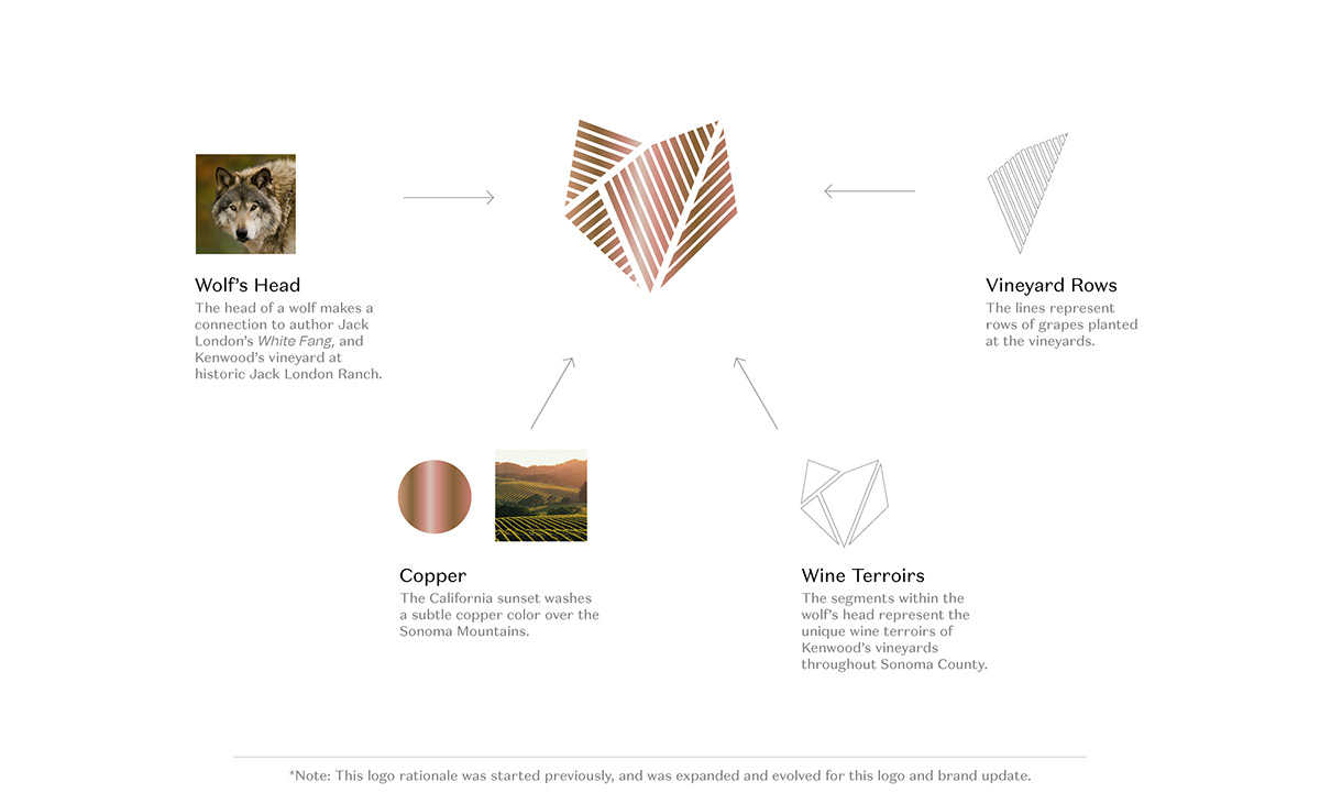
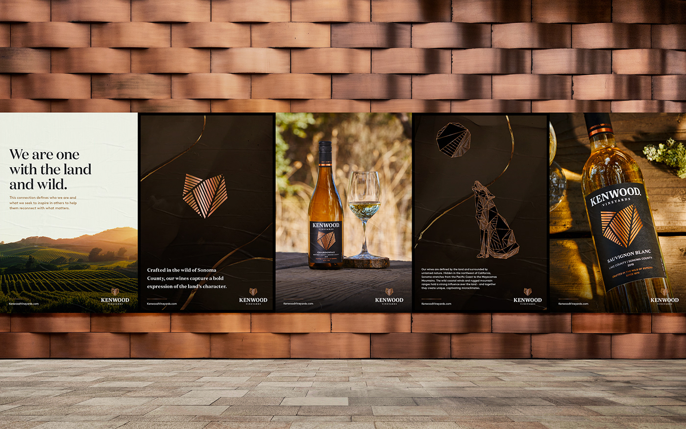
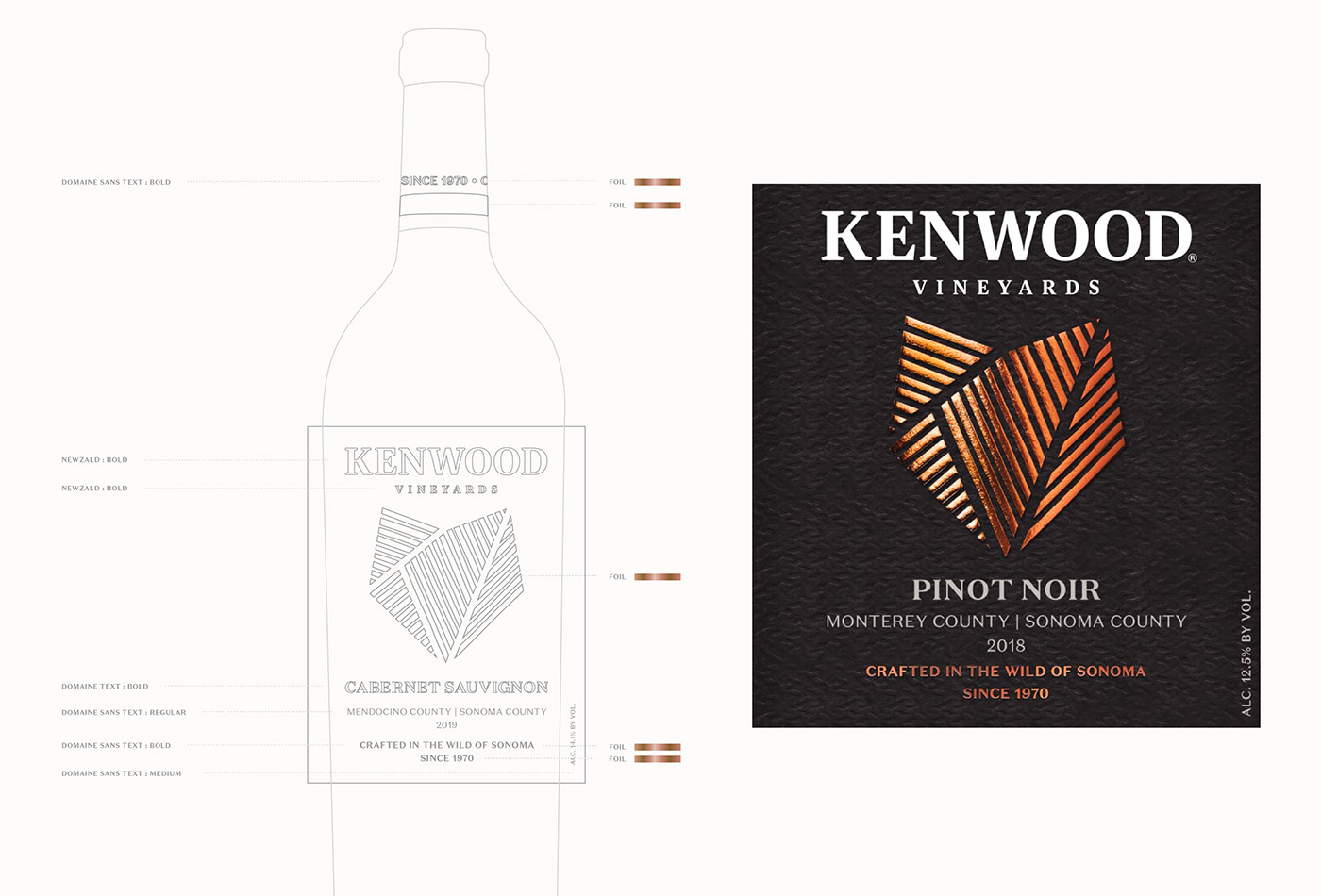
A new packaging design was created to help Kenwood stand out on the shelf and appeal to new wine drinkers. At the center of the brand identity update is an evolution of the “Wolf’s Head” logo symbol and a new wordmark. The wolf is a reference to author Jack London’s White Fang, and a Kenwood vineyard within historic Jack London Ranch. The rows and segments within the symbol represent vineyard rows and wine terroirs.
In the color palette, the warm and rich characteristics of the land are seen in all of the colors. Copper is a feature color in the packaging design, showing the color of the California sunset. The photography shows a love for the craft of winemaking, and the bold character of the land.


